Alignment
Throughout SwiftUI, alignment is used to position views. In an HStack, alignment is used to align views vertically. In an overlay, two-dimensional alignment is used to align the secondary view on top of the primary view.
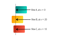
Parents can ask a view for any of its alignment guides. For example, here are some of the built-in vertical alignment guides:
By default, most containers are center-aligned, except geometry readers and scroll views. Note that the alignment can also influence the height of the stack. For example, the stack is a little taller when we use the firstTextBaseline alignment:
Explicit Alignment Guides
We can also modify how the alignment guides are computed for each view by creating an explicit alignment guide using the alignmentGuide modifier. In the example below, we can change how the first text baseline alignment guide for the rectangle is computed. Note that the guide only has an effect when the HStack is using the first text baseline alignment. Below, we can see the different vertical alignments for both views. It might be a little counterintuitive, but moving the first text baseline of the rectangle down moves the rectangle up inside its container.
For an explanation of the steps HStack takes to lay out its children vertically, refer to the HStack page.
One common use of explicit alignment guides is to align views across different guides. For example, if we want to display the center of a badge on the top trailing corner of a view, we can do so using explicit alignment guides:
Text("Buy Now") .padding() .foregroundStyle(.white) .background { RoundedRectangle(cornerRadius: 8) .fill(.blue.gradient) } .overlay(alignment: .topTrailing) { MyBadge() .alignmentGuide(.top) { dim in dim.height / 2 } .alignmentGuide(.trailing) { dim in dim.width / 2 } }
Aligning With Spacers
A common pattern to align views is to use spacers. In the example below, we show two ways to push text to the right: at the top using a spacer, and at the bottom using a flexible frame. These approaches are almost the same, but not quite. When we make the view smaller, we'll see that the breaking point is slightly different: The approach with the spacer starts word wrapping a little earlier. This is because the spacer itself has a default minLength value.
Custom Alignment IDs
To align multiple views we can use built-in alignment, or provide an explicit alignment guide when the built-in alignment doesn't suffice. However, sometimes we want to align views that do not share the same direct parent.
In the view below, the labels are displayed using a horizontal stack, and the menu button is a circle. We want to center align the icons in the items to the center of the menu button. Setting a trailing or center alignment guide on the item icons has no effect, as the horizontal stack provides its own trailing and center alignment guides. We could set an explicit alignment guide on the stack, but only by hardcoding the width of the small icon.
There is a more robust solution. Using a custom alignment identifier, we can give the item icon an explicit alignment guide. We can then align the outer vertical stack to this new identifier. As a first step, we'll declare our custom alignment identifier and add it to the horizontal alignment type:
Now we'll use the custom alignment identifier to align the outer vertical stack. Note that the explicit alignment guide is defined on the icon yet propagates up to the vertical stack (which we implemented using AnyLayout to animate opening and closing the menu).
AnyLayout(VStackLayout(alignment: .menu)) { ForEach(items) { item in HStack(spacing: 8) { Text("\(item.label)") Image(systemName: item.systemName) .alignmentGuide(.menu) { dim in dim.width / 2 } } .opacity(1) } MenuButton() .rotationEffect(.degrees(45))}
When the vertical stack queries its children for the menu alignment guide, there are three different cases: if a child provides an explicit alignment guide, that value is used. When a child doesn't provide an explicit alignment guide, the child's descendants are queried. This happens with the horizontal stack: while the stack doesn't provide its own alignment guide for the menu alignment, its second child (the icon) does, and that value is used. Finally, the third case happens with our menu button: the button doesn't have an explicit alignment guide, and its children don't either, so the guide's default value is used.
More Resources
In this article on alignment guides, Javier also shows how alignment guides work. There are a number of really interesting examples in there as well, showing implicit alignment guides, explicit alignment guides and how to use custom alignment IDs.
https://swiftui-lab.com/alignment-guides